PrintEZY
In the fall of 2023, I had the enriching opportunity to volunteer at printEZY, a burgeoning startup based in Chennai, India, specializing in doorstep printing services. Embracing the role of a Graphic Designer during my time there, I undertook a significant project to craft a minimalistic and impactful logo, contributing to the company’s visual identity. This experience not only allowed me to apply my graphic design skills but also provided valuable insights into the dynamics of branding and visual communication within the innovative realm of doorstep services. The exposure to printEZY’s ethos has profoundly enriched my understanding of design in a startup environment, leaving me eager to leverage these experiences as I continue to explore and contribute to the dynamic field of graphic design.
Logo Research: Unveiling the Depths of Visual Brand Identity Exploration

REFERENCES
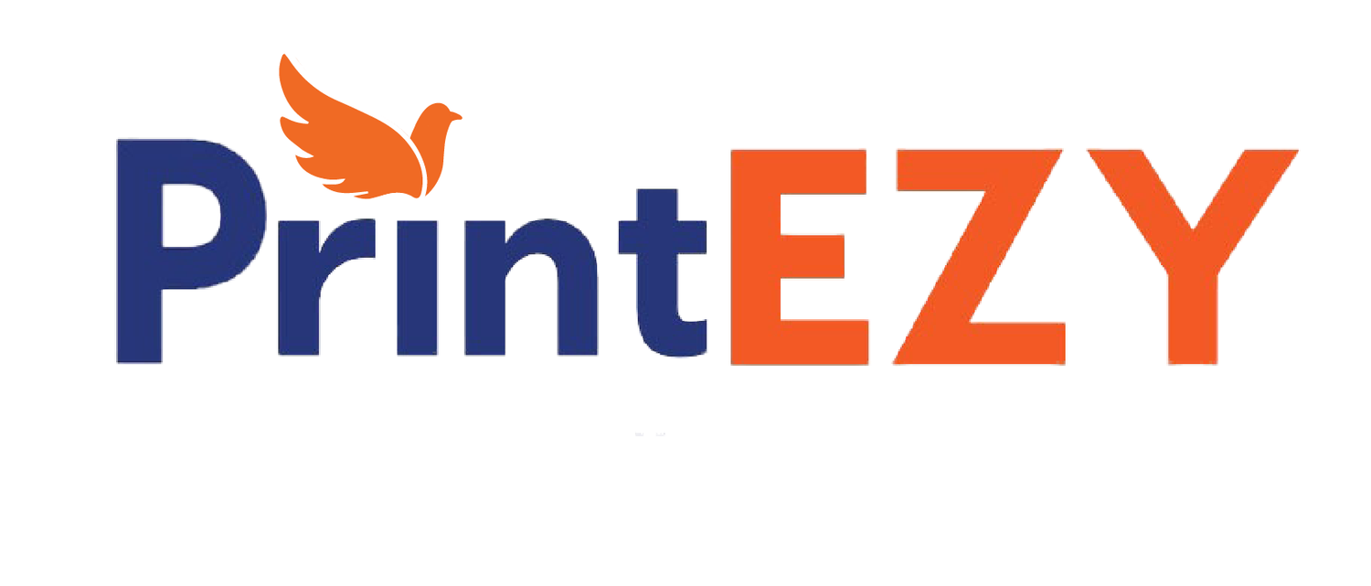
In the expansive landscape of logo design within the domain of akin printing enterprises, my meticulous research journey involved a comprehensive analysis of visual branding elements. The exploration unveiled a recurring motif in the use of CMYK colors and printer-centric imagery, establishing them as prevalent design conventions reflective of industry aesthetics. Delving deeper into this nuanced visual landscape, I contemplated alternative approaches and found myself drawn to the symbolic resonance of carrier pigeons. Renowned for their historical significance in efficiently transporting and delivering messages, the carrier pigeon offered a rich metaphor for the core values of timely document delivery intrinsic to the printing industry.
Fixated on this concept, I embarked on the intricate process of translating these conceptual insights into the design language of the company’s logo. This endeavor sought not only to align with industry norms but also to infuse the brand with a distinctive and meaningful identity. By integrating the historical symbolism of carrier pigeons with the contemporary design principles prevalent in similar printing companies, the resultant logo emerged as a synthesis of tradition and innovation.
Thus, the culmination of this extended exploration not only elucidates prevailing trends in visual brand identity but also highlights the transformative power of thoughtful integration of historical symbolism, ushering in a unique and resonant visual representation for the company in the competitive landscape of the printing industry.
Navigating the Logo Design Process
Initial Drafts:
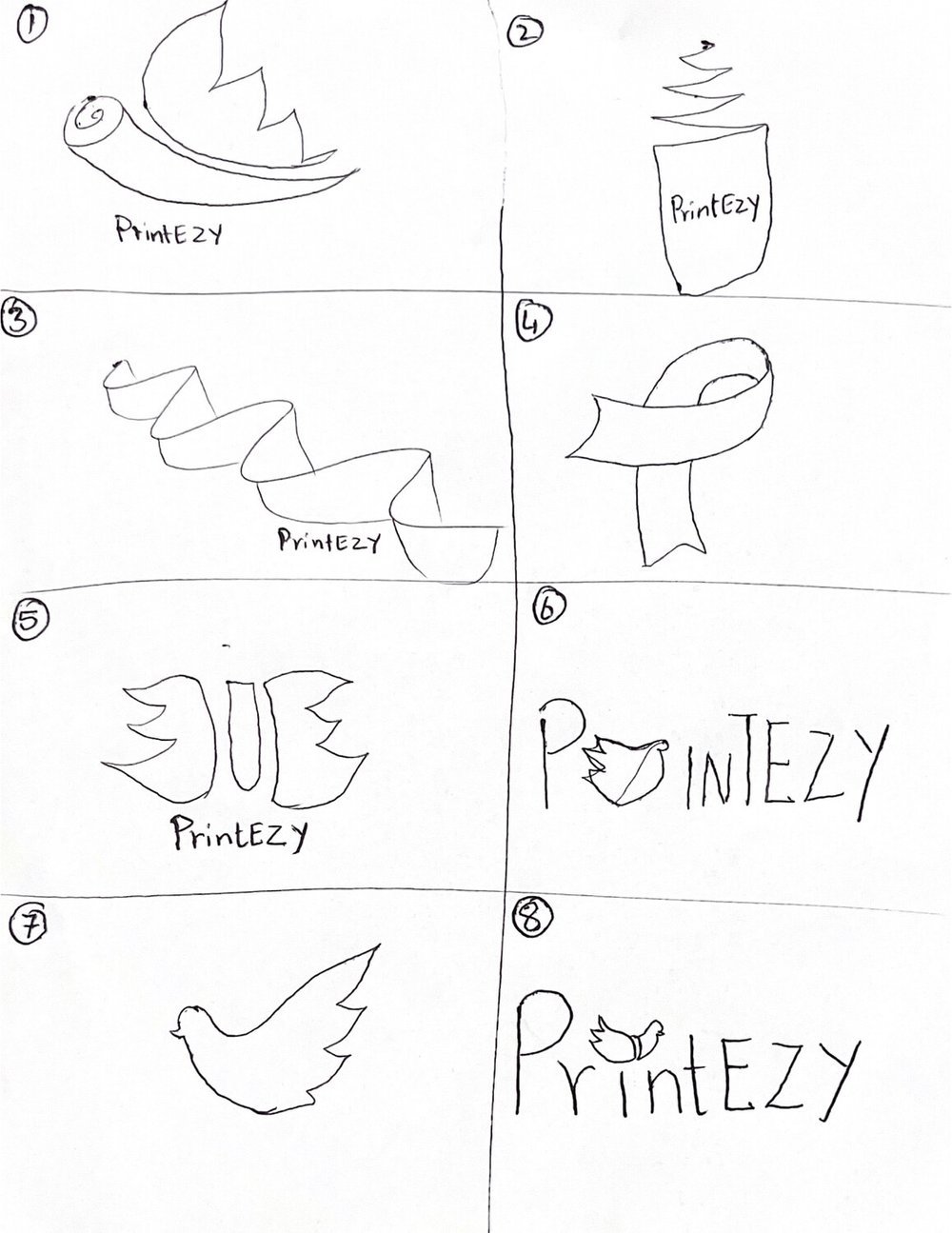
Drew sketches using paper and wings to represent the carrier pigeon.
Aiming for minimalistic style, selected logos 7 and 8 for further development.
Logo 7:
Mirrored design to depict a bird taking off (professor’s suggestion).
Received feedback from both designers and non-designers to refine the concept.

Final Logo (Logo 8)
“PrintEZY” name with the bird symbol replacing the “i” dot.
Overall:
Iterative process involving sketches, feedback, and multiple revisions.
Balanced perspectives from designers and non-designers for broader appeal.
Final Logo

Submark Logos


Praneeta Sirigiri
Feel free to contact me regarding employment opportunities or collaborations, and learn more about my skills, experiences, and passion for designing.
