DYATOPIA
The opportunity to create three distinct and compelling brand identities, each with its own unique character and message. These brands were meticulously crafted to resonate with their target audiences, effectively conveying their core values and mission. Additionally, I developed a striking book flyer and a compelling brochure, both of which served as essential tools to promote and communicate the essence of these brands to the world. This project has not only deepened my understanding of the intricacies of branding but has also allowed me to explore the multifaceted aspects of graphic design and marketing, reinforcing the importance of a cohesive and impactful visual identity in today’s competitive business landscape.
.
Goal
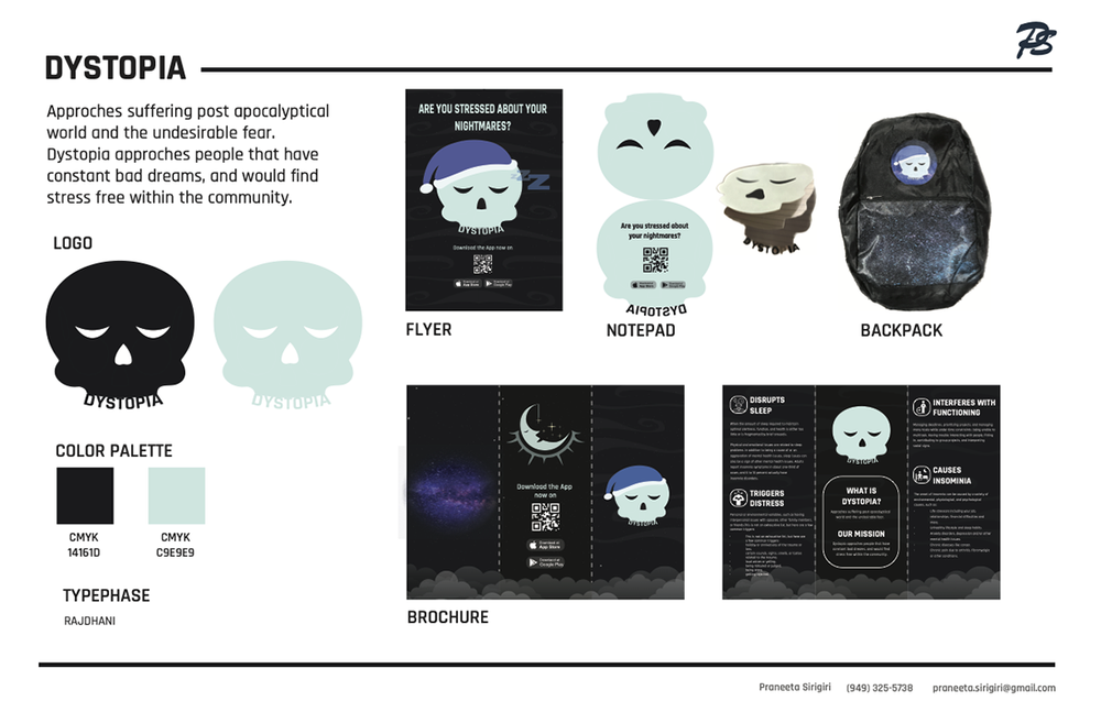
Approches suffering post apocalyptical world and the undesirable fear. Dystopia approches people that have constant bad dreams, and would find stress free within the community.
Approach
The app assists in monitoring an individual’s nightmares, and to promote its presence within the community, I’ve crafted a collection of branding items. These products serve to embed the brand’s identity into the local community
Results
PROCESS LOGO DRAFTS
-
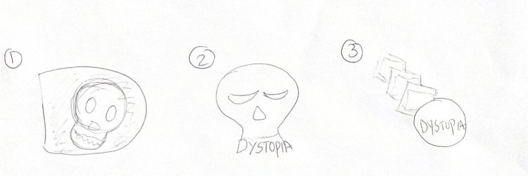
For the design, I strategically incorporated the skull within the letter “D,” symbolizing the initial character of “dystopia.”
-
In the second logo, I opted for the final design by integrating the name “Dystopia” within the skull, mimicking it as teeth.
-
In the final rendition, I incorporated the name into a circular design and arranged a series of square boxes in descending order. This symbolic representation conveys the idea of returning to dreams and gradually unveiling the layers of nightmares.
BROCHURE
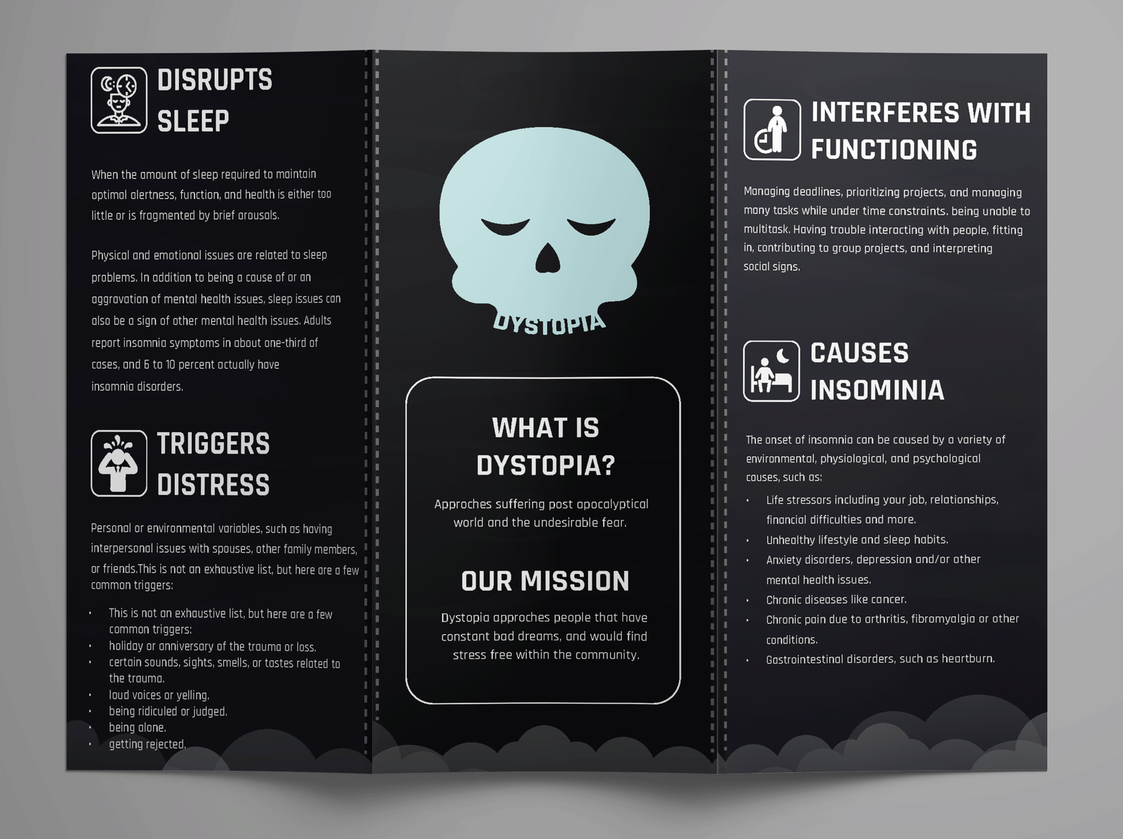
Brochure Highlights:
- Sleep Disruption: Nightmares disrupt peaceful slumber, leaving you drained and frustrated.
- Emotional Distress: Nightmares induce emotional turmoil, leading to anxieties and cold sweats.
- Daily Doldrums: Nightmare remnants affect daytime focus and mood, causing foggy feelings.
- Insomnia’s Shadow: Fear of recurring nightmares fuels insomnia, trapping you in a relentless cycle of sleeplessness.
- Comprehensive Solution: Our app addresses sleep disruption and emotional turmoil caused by nightmares.
- Empathetic Companion: We provide support and guidance to help you navigate through the fear and helplessness induced by nightmares.
These points serve as gentle reminders for users to recognize their neglected sleep issues and encourage them to utilize our app for tracking and finding relief from distress.
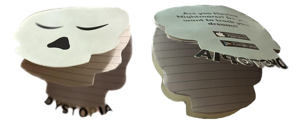
NOTEPAD
Scan the QR code on the back for instant access to our app on both the App Store and Play Store. Jot down your thoughts, then seamlessly transfer them to the digital realm for organization and safekeeping.
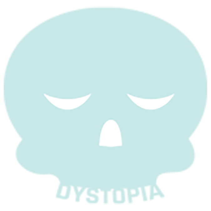
LOGO 1
This represents the primary logo featuring a skull, where the teeth are creatively replaced with the name to emulate their structure.
NOTEPAD
Scan the QR code on the back for instant access to our app on both the App Store and Play Store. Jot down your thoughts, then seamlessly transfer them to the digital realm for organization and safekeeping.
POSTER
Poster Highlights:
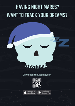
Poster design created using Illustrator and InDesign for Cosmic Canvas.
- Deep blue background with swirling stars and ethereal clouds evokes mystery and contemplation.
- Celestial elements have lower opacity to create depth without overwhelming the poster.
- Provocative questions like “Having nightmares?” and “Want to track your dreams?” strategically placed to spark curiosity.
- Bold logo stands out against the dark backdrop, anchoring the brand and leaving a lasting impression.
- Central location ensures visibility and reinforces brand recognition.
- QR code seamlessly invites viewers to download the app, bridging the gap between analog and digital.
- App Store & Play Store logos highlight platform accessibility and broaden potential user base.
- Adaptable design suitable for various locations, from walls to bulletin boards.
- Targeted at a diverse audience interested in dream exploration and tracking.
- Memorable visuals and effective call to action encourage immediate app download.
NOTEPAD
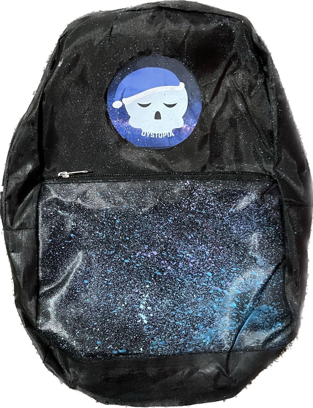
- Logo Takes Center Stage: Your ion-adhered logo gleams prominently at the top, serving as a proud representation of your brand.
- Galaxy Takes Over: Below, the canvas bursts with a cosmic fusion of blue and purple paint, turning the backpack into a miniature nebula.
- Splatters Speak Volumes: Each carefully placed splatter tells its own story, adding a unique and personal touch that sets your backpack apart as one-of-a-kind.
- Stellar Craftsmanship: The seamless integration of the logo and galactic design results in a mesmerizing piece that exudes both style and significance.
Praneeta Sirigiri
Feel free to contact me regarding employment opportunities or collaborations, and learn more about my skills, experiences, and passion for designing.
