Riso Poster
“Live Up to What You Love”
As a student in this typography class, I have embarked on a captivating journey into the world of visual text communication. Throughout the semester, I!&ve honed my skills in fonts, layouts, and design principles, learning how words can transcend mere meaning to evoke emotions and make a visual impact. Crafting a thought-provoking risk poster challenged me to skillfully employ typefaces, colors, and composition to convey essential messages. Transitioning into the realm of multimedia, I brought poetry to life through typography in a captivating video. Finally, designing my autobiography book was an intimate journey, pouring my typographic expertise into a personal narrative. These projects have not only deepened my mastery of typography but have also highlighted its power in communication and design. Typography has become a profound means of expression and a tool for shaping the world!&s interaction with the written word, expanding my horizons and deepening my appreciation for its beauty and impact.
FIRST DRAFTS

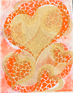
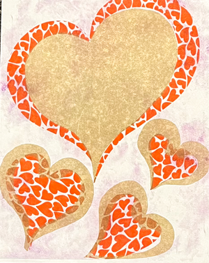
I experimented with adding a striking neon pink background adorned with red and gold hearts, creating a dazzling and romantic atmosphere.
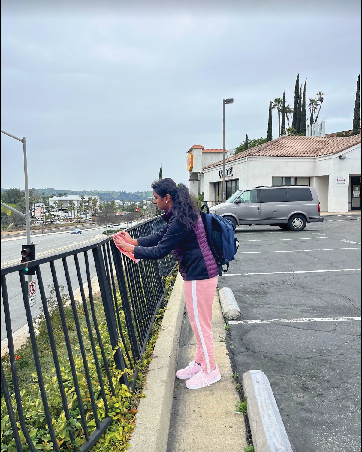
To experiment with the final output, I decided to flip the design and print it upside down to observe the intriguing visual effects and potential creative variations.
IN THE ENVIRONMENT
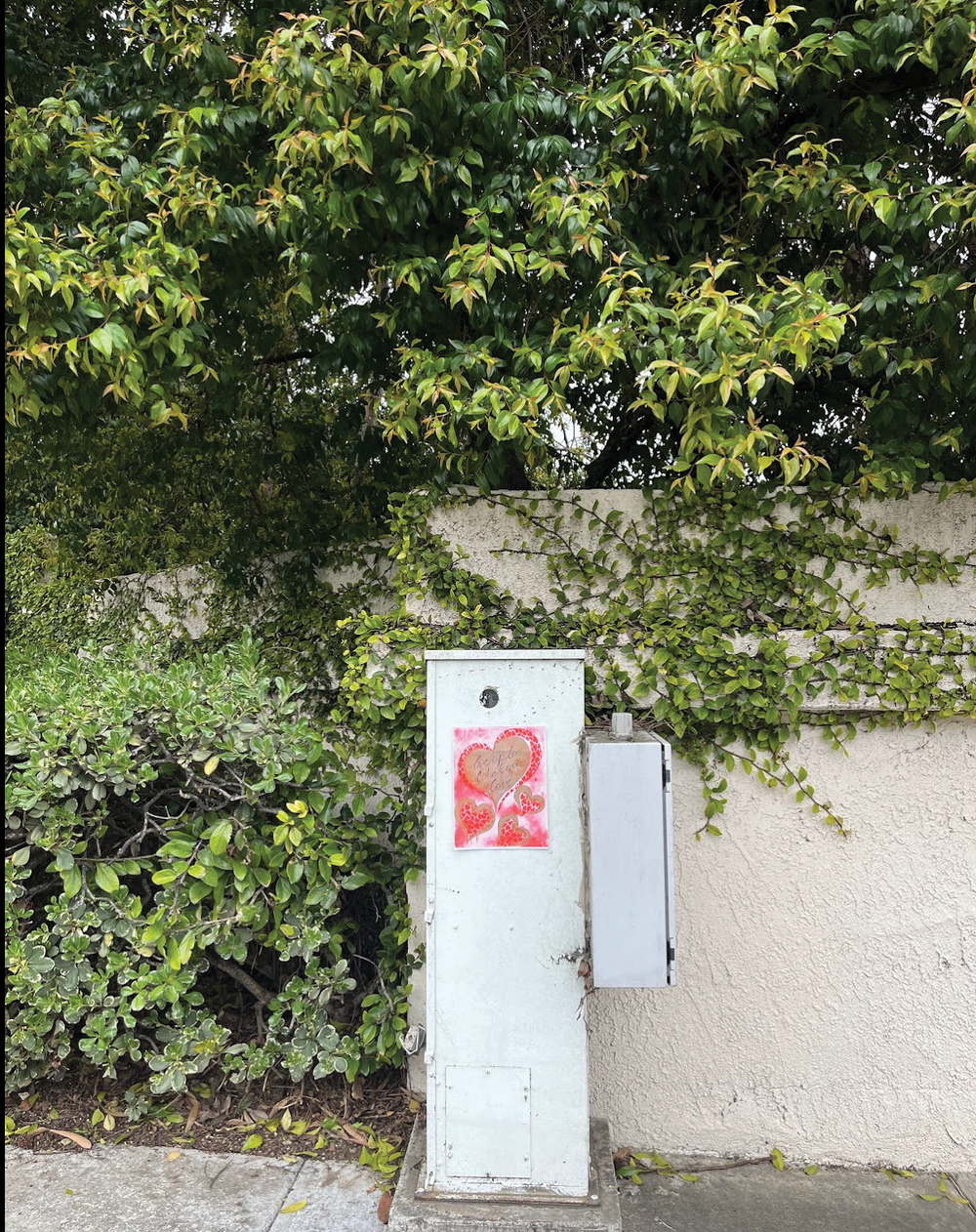
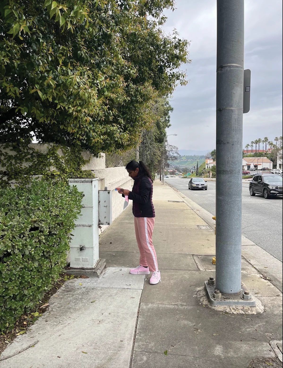
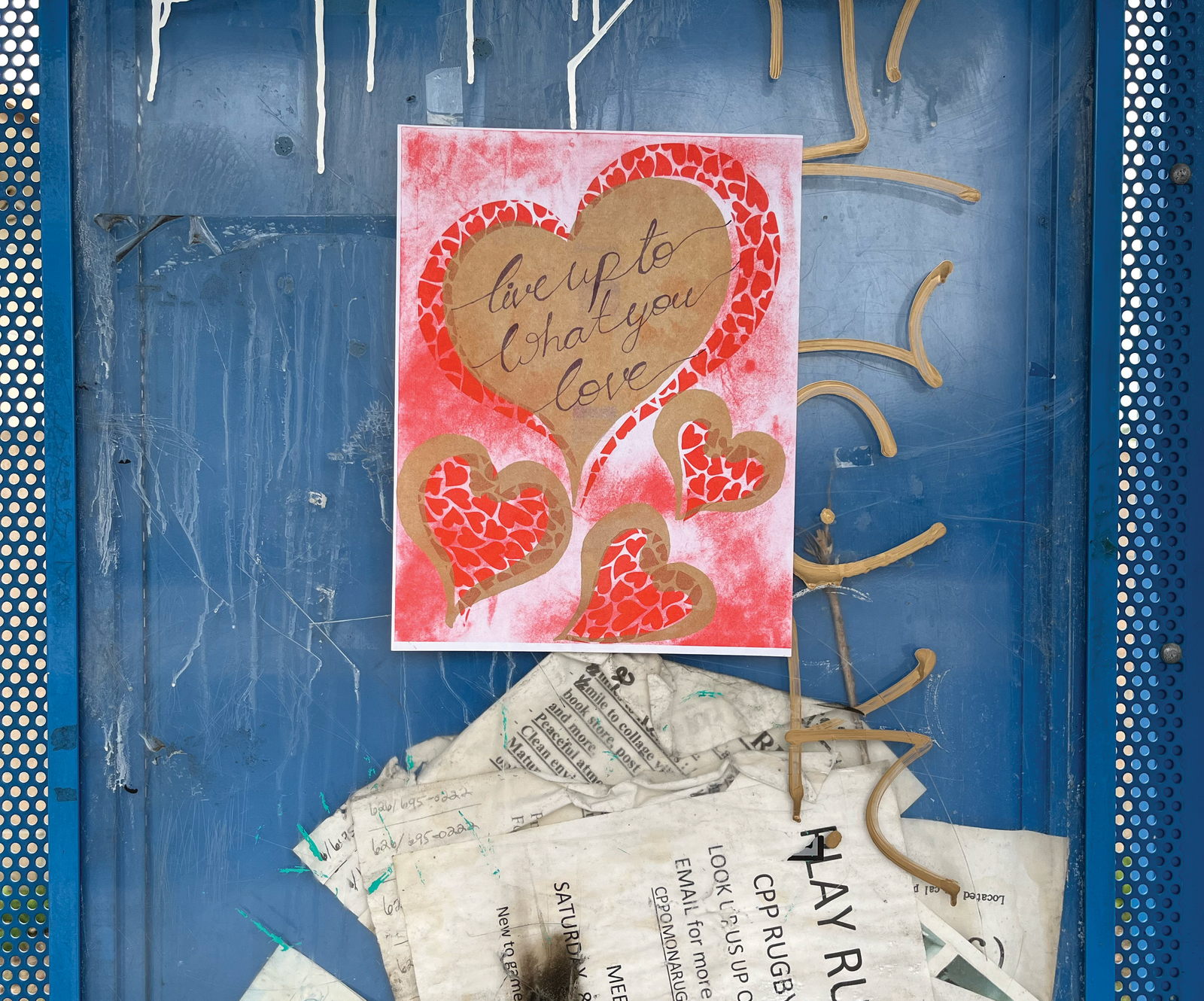
I strategically placed 50 posters around the environment, affixing them to street busters and poles to inspire and motivate people as they navigate their surroundings.
MATERIALS USED
-
Riso colors, red, gold, purple
-
50lb paper
“Live Up to What You Love”encapsulates my journey, where passion meets skill in the dynamic world of visual communication.
Praneeta Sirigiri
Feel free to contact me regarding employment opportunities or collaborations, and learn more about my skills, experiences, and passion for designing.

