From The Kitchen
In my 5D Foundation class and two accompanying workshops, I embarked on a transformative journey into the world of design, where creativity, innovation, and problem-solving became my guiding principles. Throughout this immersive experience, I had the unique opportunity to conceptualize, design, and refine three distinct mobile applications. What made this process truly exceptional was that each of these applications presented a set of intricate challenges, which I tackled head-on through thorough research and rigorous interviews. These endeavors not only enhanced my technical skills but also deepened my understanding of user-centric design and the importance of conducting comprehensive user research. In this introduction, I will take you on a journey through my 5D class, highlighting the pivotal moments when creativity met real-world problem-solving, and how these experiences have shaped my perspective on design.
Problem Statment
Marketing and connecting with customers for small businesses can be a costly and challenging endeavor. Simultaneously, customers often face difficulties in locating genuinely authentic and hygienic food options.
Research Question
What strategies can be employed to facilitate the connection between small businesses and customers, ensuring the delivery of authentic and hygienic food options?
Persona
Frustrations
Routine
Name- Victoria
Age- 40
Gender- Female
Victoria had previously initiated a small catering venture, but it faced a setback due to the impact of COVID-19. Now, she aims to relaunch her business but lacks the sufficient savings required to establish a restaurant.
Victoria needs to attend to her children, including picking them up and dropping them off atschool and various extracurricular activities. She has a deep passion for preparing a wide variety of dishes for both her family and friends.

LAUNCH SCREEN
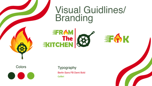
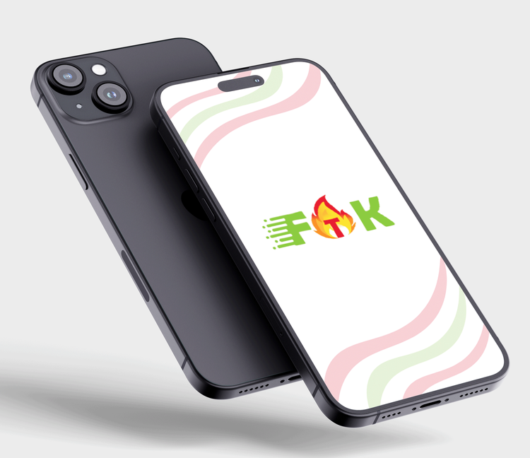
Prominent placement: The logo takes center stage, instantly capturing attention.
Culinary experience reflected: The logo evokes the feeling of home-cooked goodness.
Central element: It serves as a core symbol of the brand’s identity.
BUILDING A SANDWICH
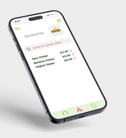
Sandwich: Feast your eyes on a delectable array of sandwiches, ready to satisfy your cravings.
Pick Your Choice: Explore the tempting options, from classic favorites.
Cart: With a tap, add your chosen sandwiches to your virtual basket, ready to checkout and conquer your hunger.
Placement: The logo takes center stage, instantly capturing attention.
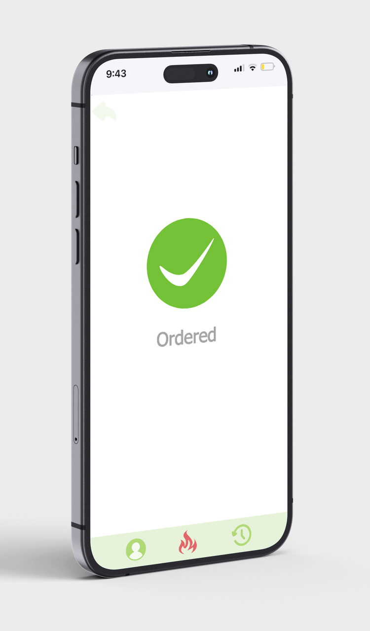
ORDER CONFORMATION
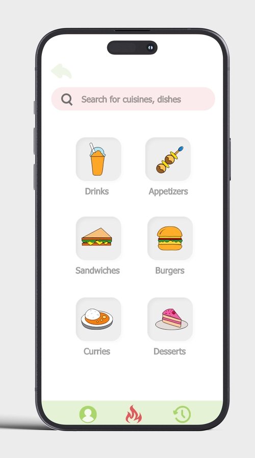
DASHBOARD
1. Discover Diverse Food Options:
Six Distinct Squares: The home screen presents a clear and organized layout with six dedicated squares, each showcasing a different food category: drinks, appetizers, sandwiches, burgers, curries, and desserts.
Visual Inspiration: Each square features enticing visuals of the food category, making it easy to browse and discover new dishes.
2. Effortless Navigation:
Search Bar: Located conveniently at the top of the screen, the search bar allows users to quickly find specific dishes or cuisines.
Global Navigation Menu: The bottom of the screen houses a permanent menu providing access to user profiles, the home screen, and order history.
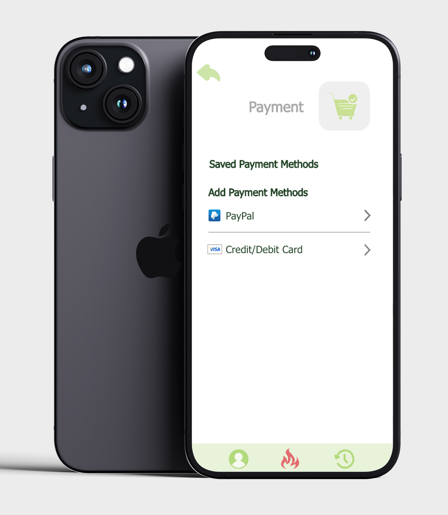
PAYMENT
1. Discover Diverse Food Options:
Six Distinct Squares: The home screen presents a clear and organized layout with six dedicated squares, each showcasing a different food category: drinks, appetizers, sandwiches, burgers, curries, and desserts.
Visual Inspiration: Each square features enticing visuals of the food category, making it easy to browse and discover new dishes.
2. Effortless Navigation:
Search Bar: Located conveniently at the top of the screen, the search bar allows users to quickly find specific dishes or cuisines.
Global Navigation Menu: The bottom of the screen houses a permanent menu providing access to user profiles, the home screen, and order history.
Praneeta Sirigiri
Feel free to contact me regarding employment opportunities or collaborations, and learn more about my skills, experiences, and passion for designing.
